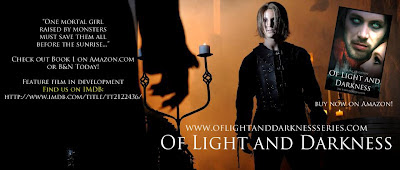
So I had no idea that Light and Darkness was not only a book but .... Check out the movie news:
Click on the banner to enter the amazing world
Movie poster :
Awesome right!!!!
I have been lucky enough to feature an interview with the talented author, musician and movie star ~
Shayne Leighton
In Shayne's first year out of high school she penned, co-directed, and starred in the feature film 'The Incubus', a paranormal romance, which obtained distribution and screened in over fifteen theaters across South Florida among major theater chains such as Regal, AMC, and Cinemark. 'The Incubus' has also obtained a passionate fanbase of over 100,000 girls online and has garnered the attention of reporters from the Miami Herald, CBS News, and NPR Radio.
Leighton also starred alongside Scream Queen, Tara Cardinal, in the film 'Legend of the Red Reaper' which will make its world debut at the 2012 AFM in Los Angeles.
Now, 21-year-old Leighton is excited to release her debut young adult novel series, 'Of Light and Darkness', set in contemporary Prague, as well as developing the film adaptation of the novel series starring Michael Welch from the 'Twilight Saga' and Cassie Scerbo from ABC Family's 'Make It Or Break It' and 'Teen Spirit'. The novel series is represented by internationally renowned literary manager, Joel Gotler of IPG.
Recently released songs can now be heard on ReverbNation.com with a full-length album in the works. Leighton is currently named #35 on the pop charts in Miami, FL.
Named #26 in Boca Magazine's "Top 100 'It' People" for 2011, Shayne has joined many other up and coming celebrities by obtaining representation by Arcadium Entertainment.
What does Shayne have to say about what makes a winning book cover?
Interview Questions:
What are the key elements that tie in the cover with the story?
There's a couple of key symbols on the Of Light and Darkness (book 1) cover that tie heavily into the story. The major one being Valek's eyes. They seem to jump right off the page. I focus a lot on the description of Valek's eyes in the story because Charlotte (my human character) is so hypnotized and entrapped by them and their beauty. Not only that, but also because they glacier blue-green color of Valek's eyes are a shared attribute with all the vampires in my story. I wanted readers to know right away that he was paranormal, and since his eyes are a telltale sign of his vampirism, I wanted to focus on that. A few other symbols are the spires from Prague Castle, since the story takes place in Prague. Also the way Charlotte's face is angled up to Valek who is staring at the reader head-on. This is meant to signify that he is the hero and Charlotte looks to him for protection. Another, more subtle symbol is Valek's right scarf that appears a bit faded on the far left of the book cover. This is a symbol for free-flowing blood and also, in the opening scene of the novel, when Valek finds Charlotte as an infant, he cradles her in his red scarf and takes her home in it.
Who designed your cover?
I did! :) I was lucky enough to have a really awesome publisher that gave me a lot of freedom in the final product of what my novel would turn out to be. We created one cover for the eBook and I decided I wanted a different look for the paperback edition.
What is the favorite part of the cover?
My favorite part of the cover are the muted reds, blues, and grays paired with the harshness and the haunting quality of Valek's stare. I think it really depicts the paranormal nature of the story and him as a character pretty well right off the cuff, before the reader ever opens the book.
Of Light and Darkness is about Charlotte, a mortal girl bound between the lines of light and darkness, must fight for life and love in a mystical realm of vampires, elves, and creatures of myth and fantasy, in a town just beyond the boundaries of the modern world.
What advice do you give others about creating a award winning cover?
The best advice I can offer is just to know your story inside and out. Knowing the mood and various elements of your story really well, along with a good artistic eye for an overall picture, will definitely promise to build the foundation
In you opinion does a great cover sell a book?
Yes, I definitely think that's true! A good cover draws your attention immediately and makes you want to flip to the back cover to read what the story is about it. I definitely judge books by their covers and that initial draw makes me want to inquire more.
Follow the awesomeness and excitement :


Awesome cover and CONGRATS on the movie deal. How exciting!
ReplyDeleteCool cover & poster, talented young lady and great interview!
ReplyDeleteWOW... actress, musician and author!? I'm so envious!!
ReplyDeleteThe cover is so striking... those eyes just draw you in and melt you! Awesome!
Awesome. awesome.. congrats.. Regards : kollywood gallery
ReplyDeleteGreat! the author seems cool and i love the covers.
ReplyDelete